
Piggy's Island K-BBQ Restaurants
Branding Renewal Design
Role:
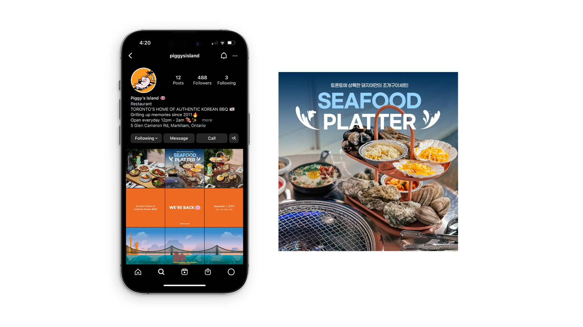
As Branding Co-Director and Lead Graphic Designer, I led the rebranding project from concept to execution. Starting with a mood board to establish the desired atmosphere, I redesigned the pig mascot from the original logo—making it more lively, approachable, and fun while preserving its recognizability. My responsibilities included logo refinement, signage design, interior visual coordination, colour system development, marketing collateral, menu design, photo editing, advertising campaigns, and social media assets. By working closely with the visual director, interior designer, and printing companies, I ensured that every brand touchpoint—from digital to physical space—reflected the restaurant’s refreshed identity.
Overview:
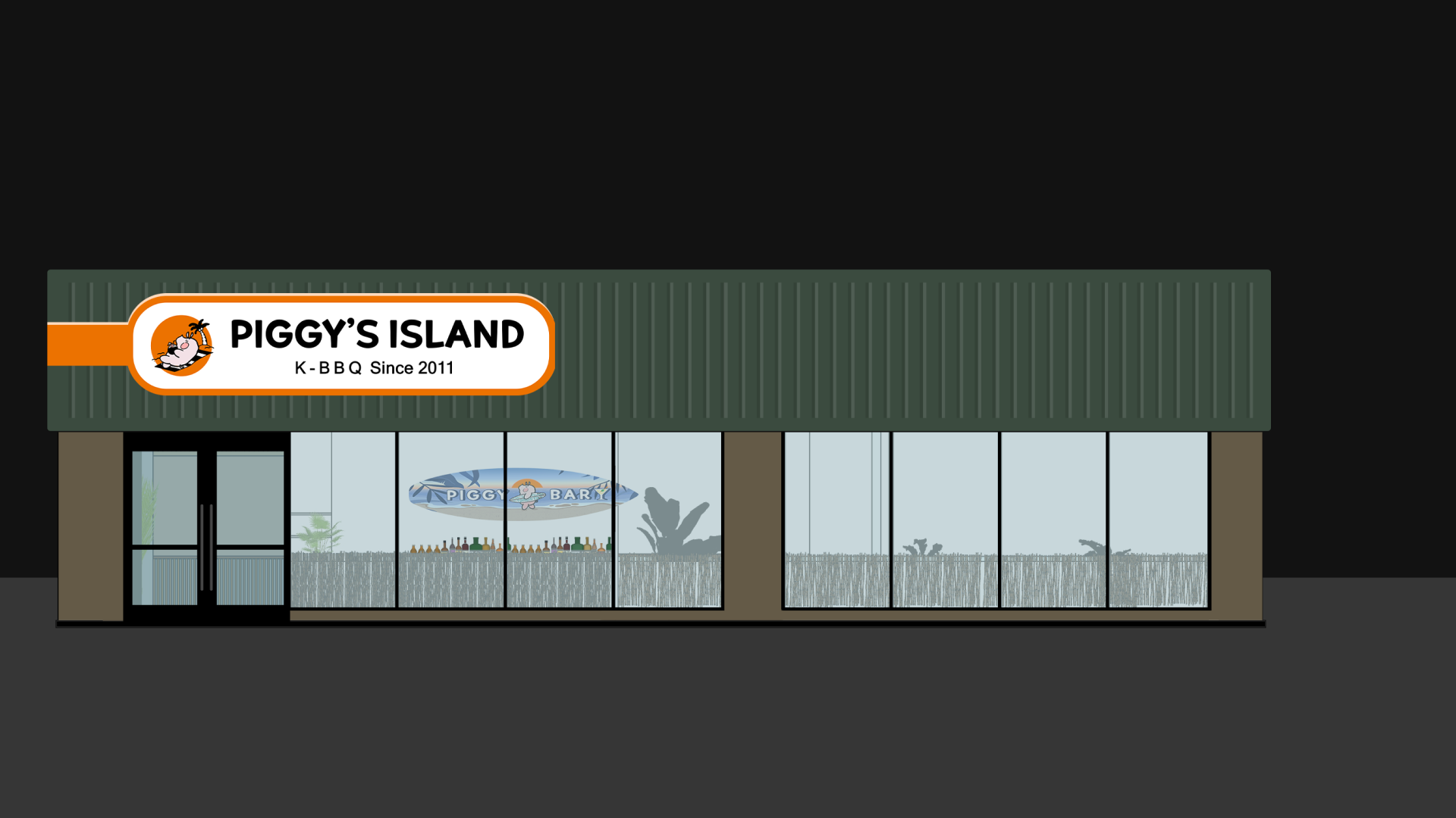
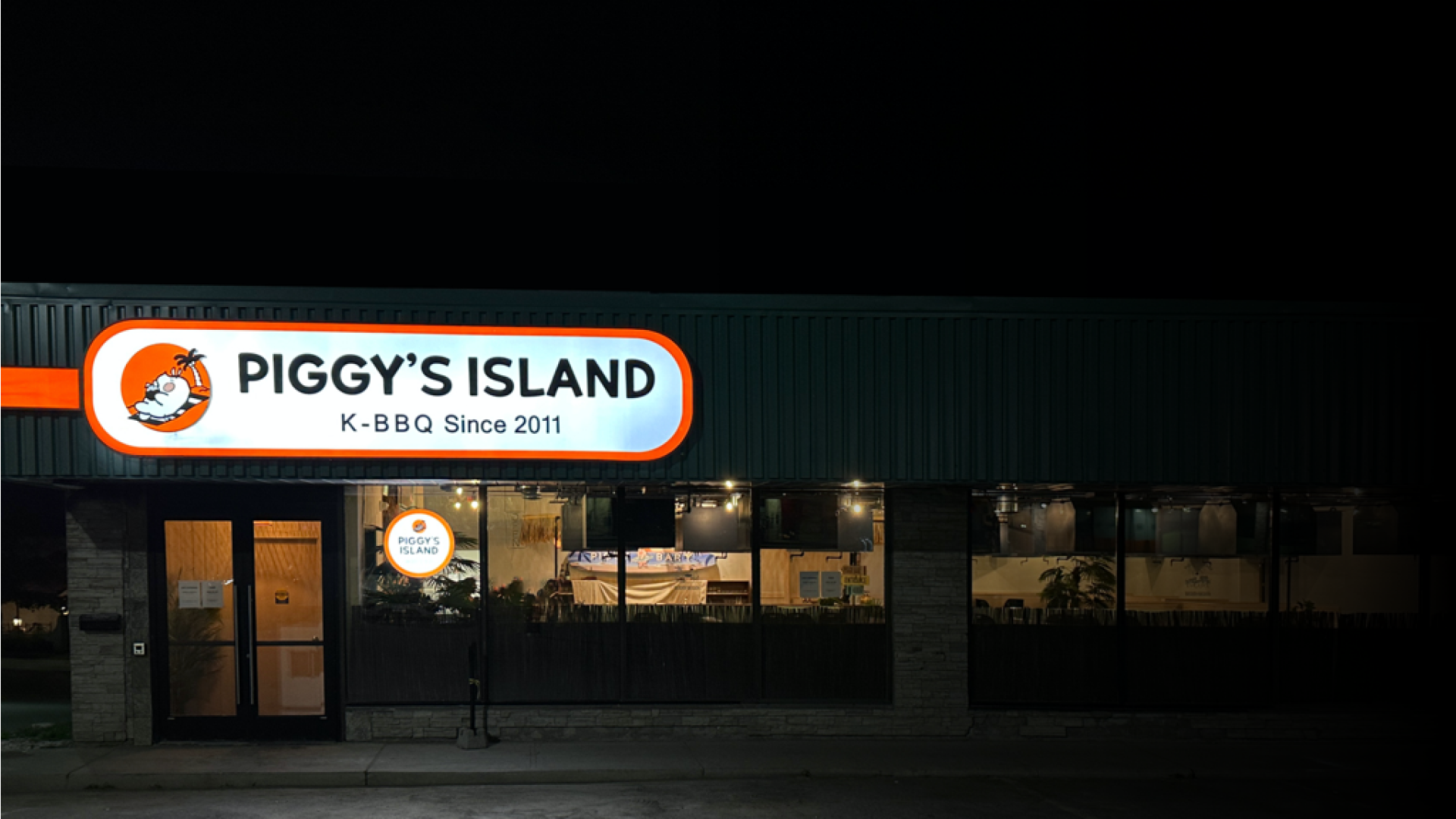
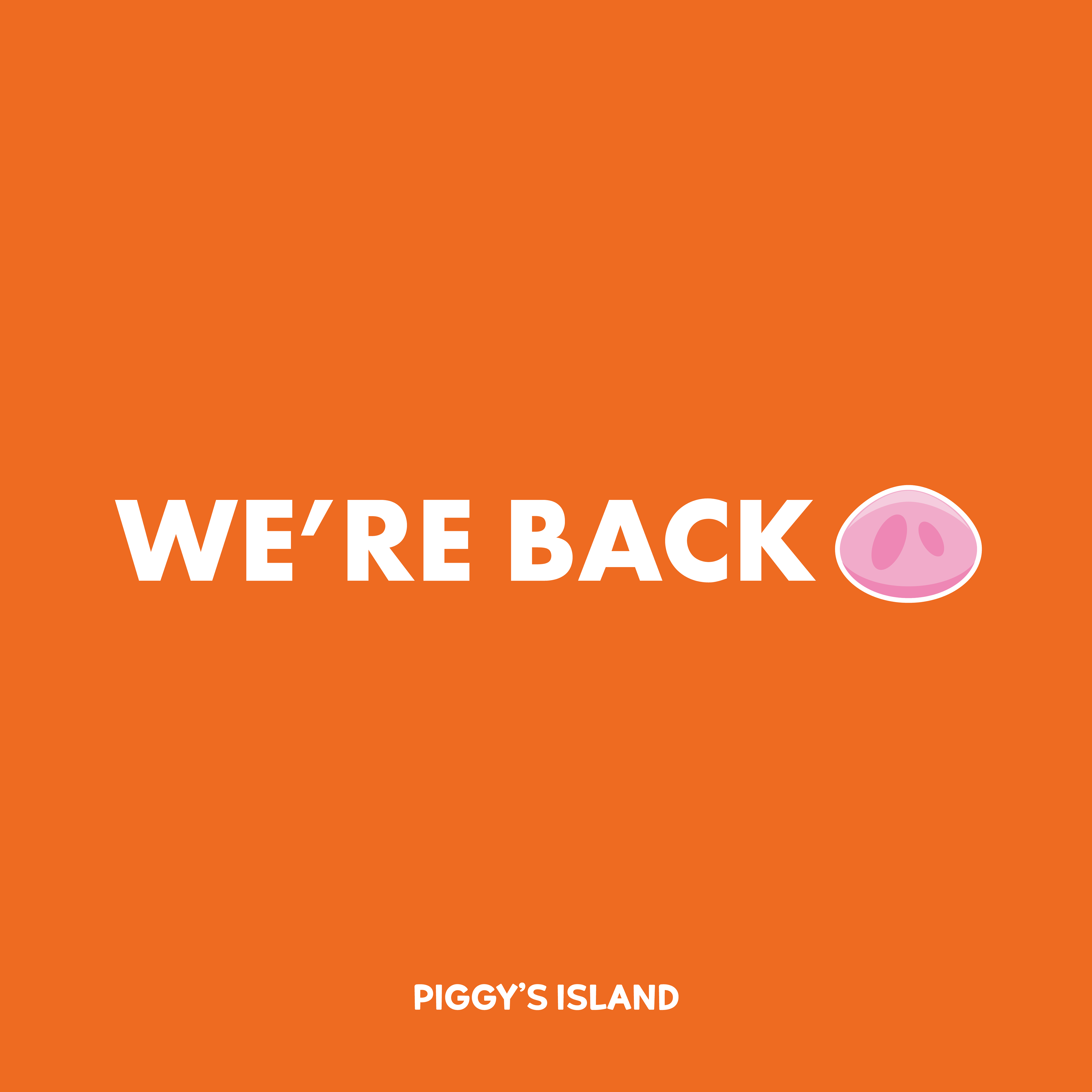
Piggy's Island, originally opened in 2011 as a family-friendly K-BBQ restaurant in Toronto, has undergone a full revitalization after facing a fire incident three years ago and the challenges of the COVID-19 pandemic. Reopening after four years, the restaurant shifted its brand identity from a mature ambiance to a fresh, healthy, and youthful atmosphere, aiming to attract a younger audience. The new direction was designed to provide guests with a joyful, vacation-like experience, offering a refreshing escape from Toronto’s long winters.

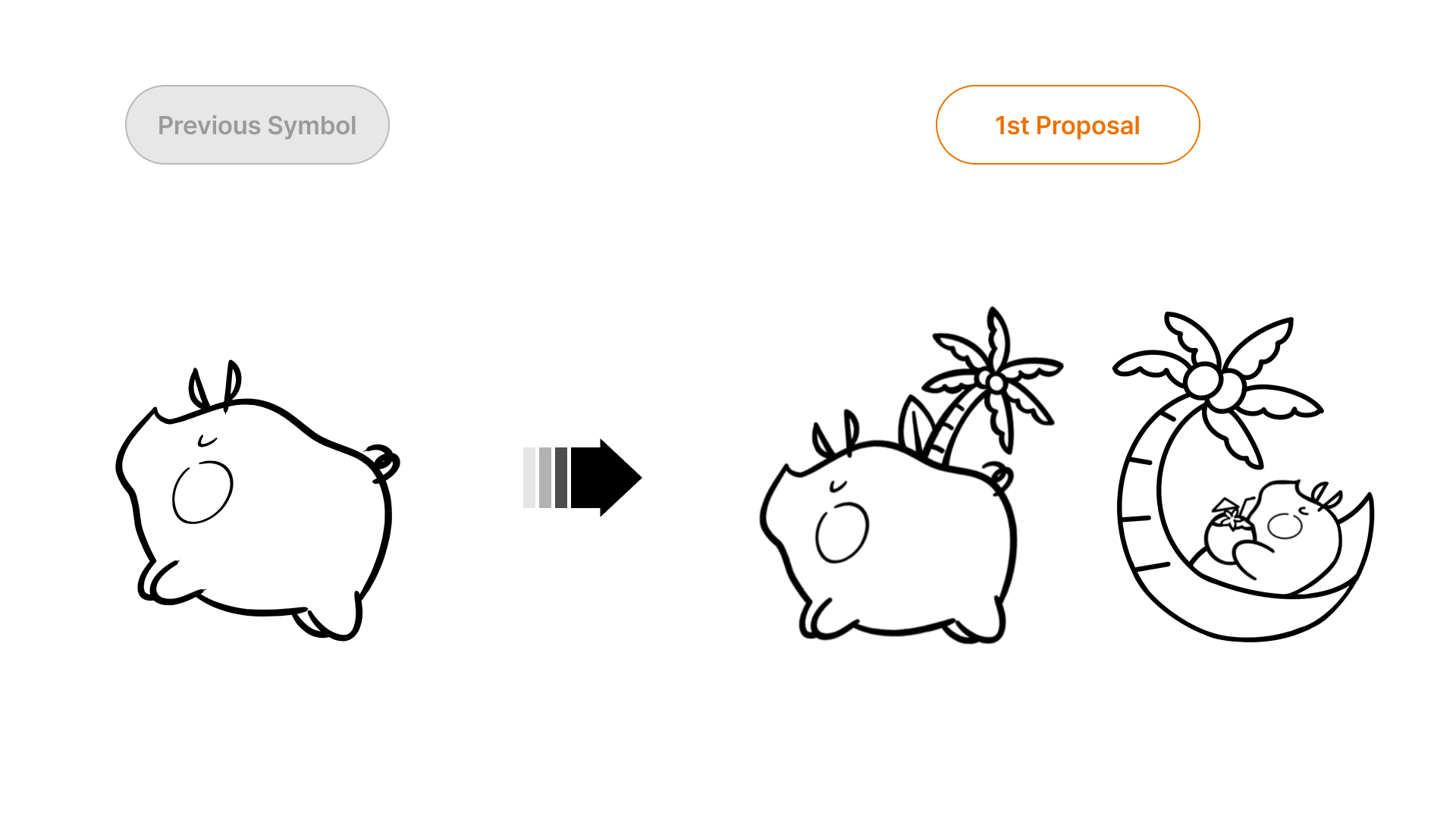

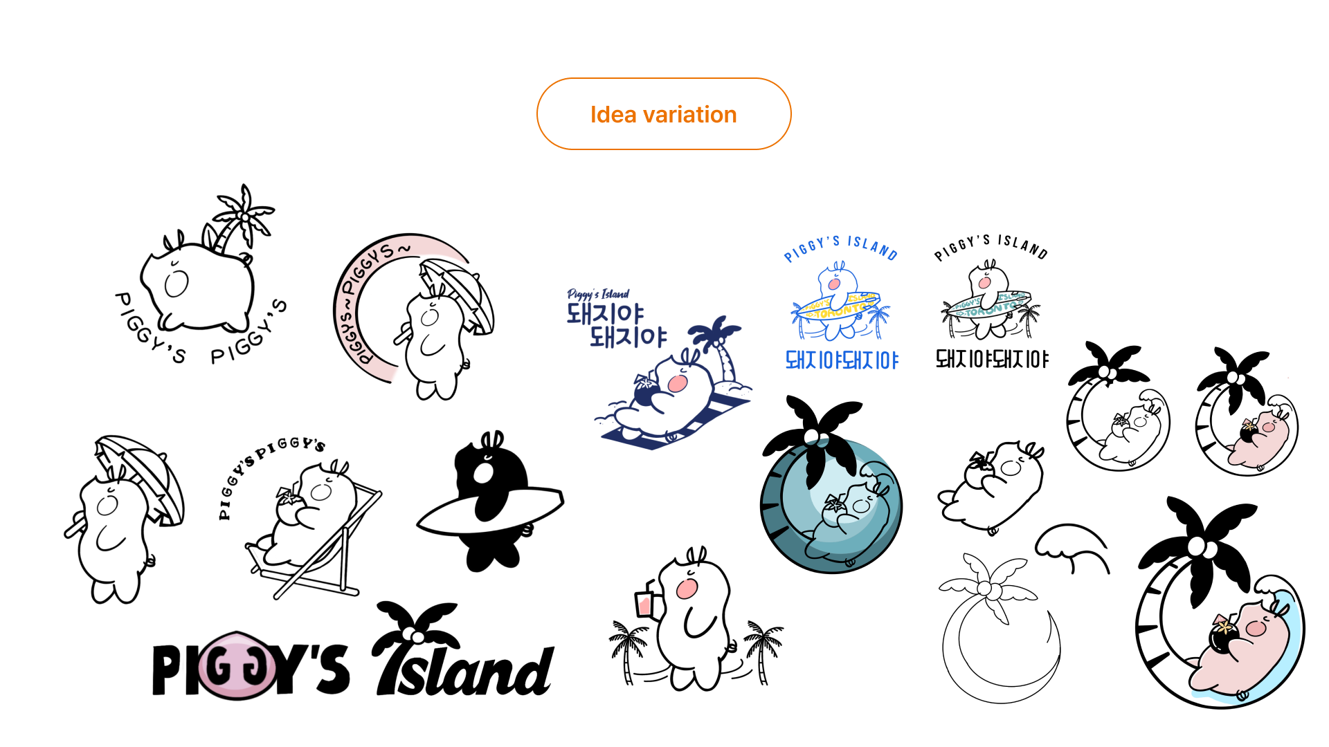
When the client requested an illustrated design style, I began by sketching the pig mascot in Procreate using a hand-drawn, sketch-like approach. I experimented with various expressions, poses, and movements to refine the character’s personality. After finalizing the sketches, I transferred the design into Illustrator to create a polished and stable composition, completing the final mascot design.
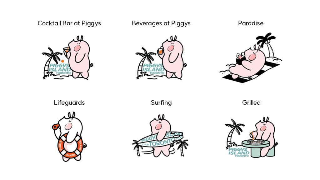
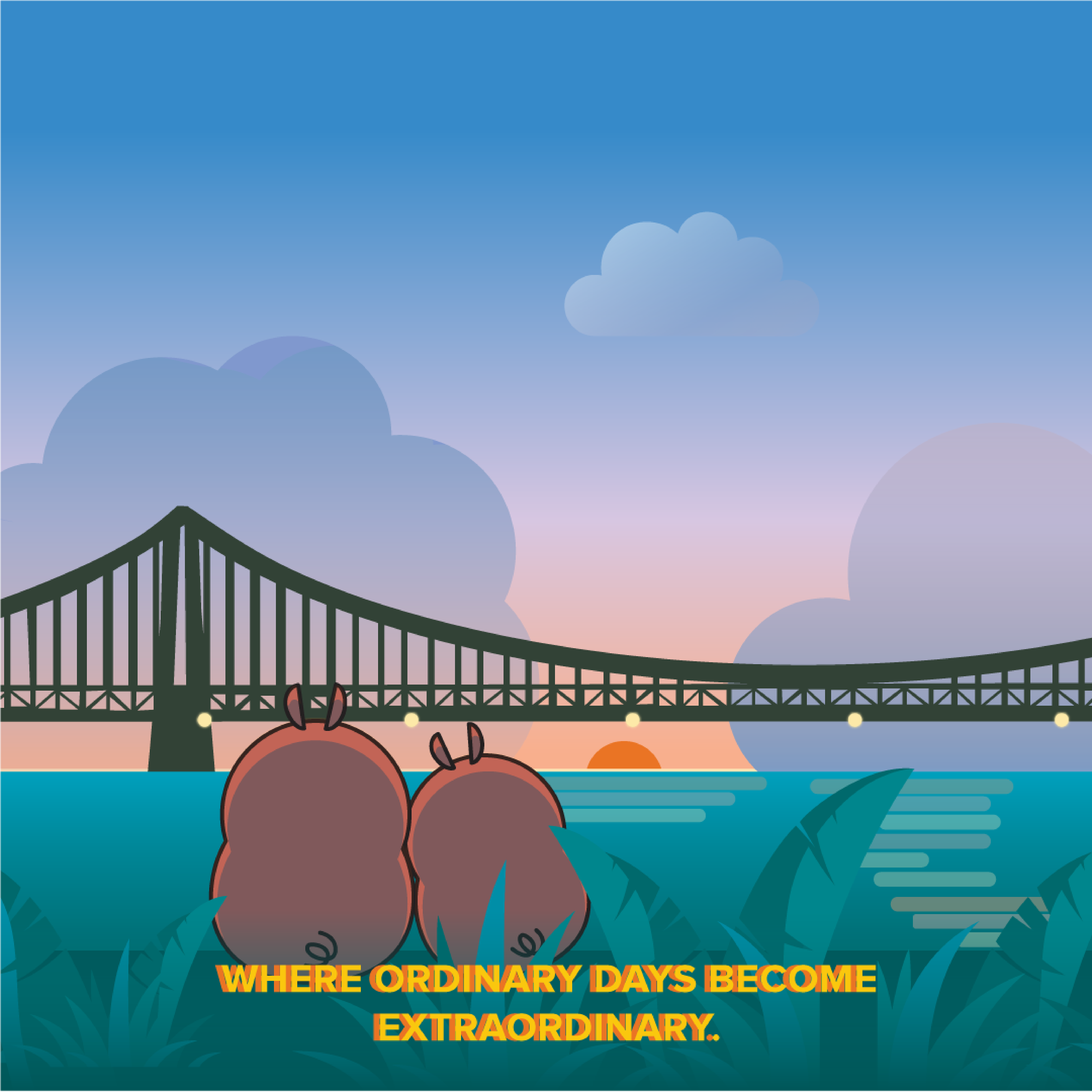
The reimagined pig mascot brings a more charming, approachable, and playful identity to Piggy’s Island. Designed as a versatile character, it can be applied across multiple brand touchpoints—such as menus, posters, and social media—ensuring strong recognition and a lasting impression. Ultimately, the mascot captures the joyful spirit of Piggy’s Island and serves as a signature symbol of the revitalized brand.
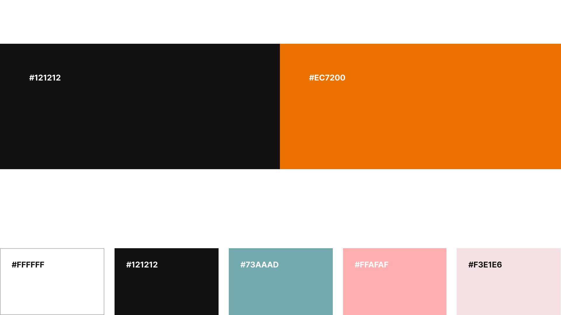
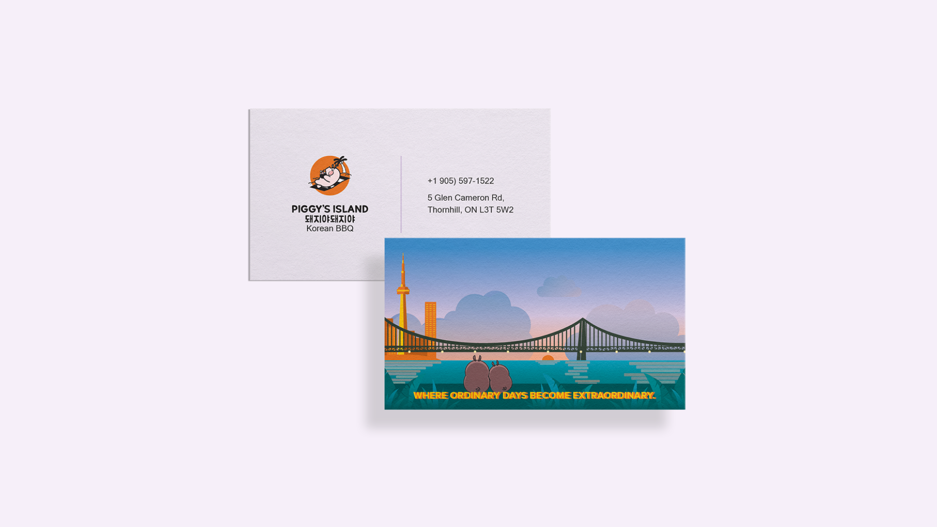
Main colour - The main colour for the logo and signage is orange. I chose orange because it is a soft yet appetite-stimulating colour that creates a lively atmosphere, which suits the new concept of Piggy's Island.
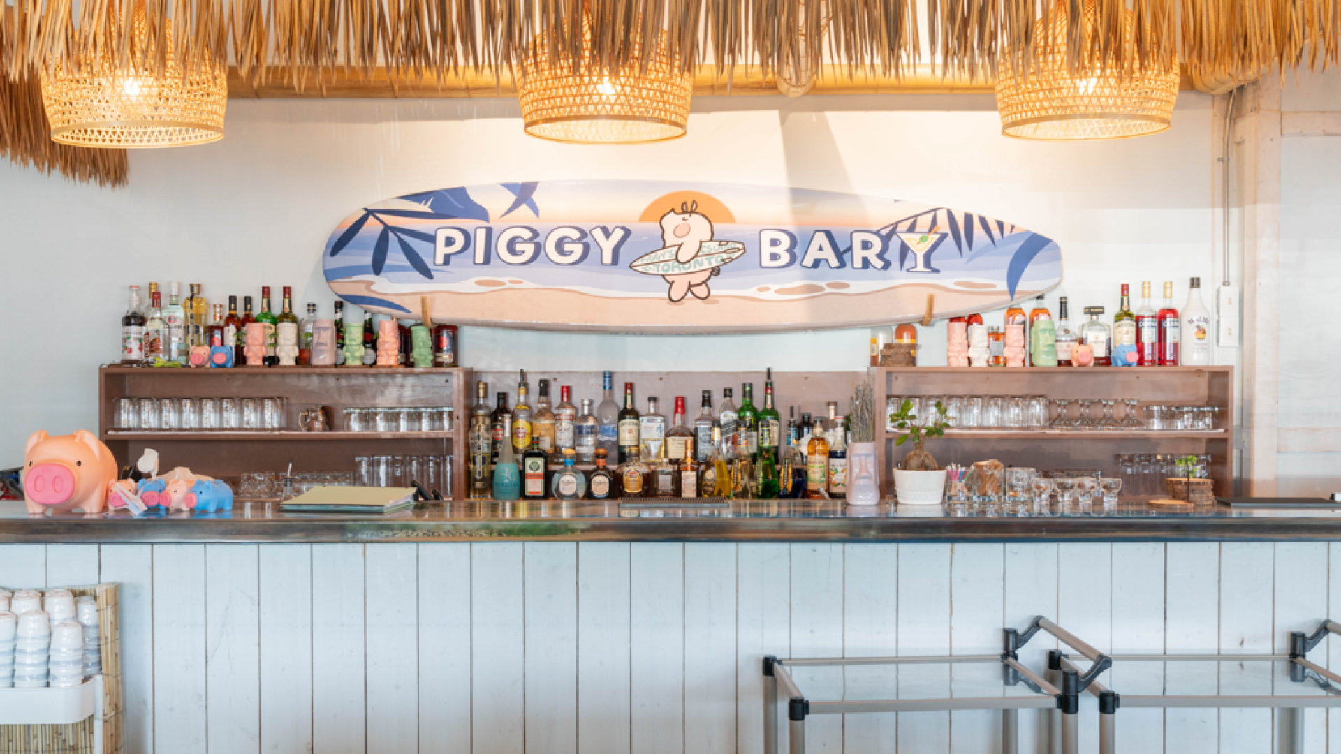
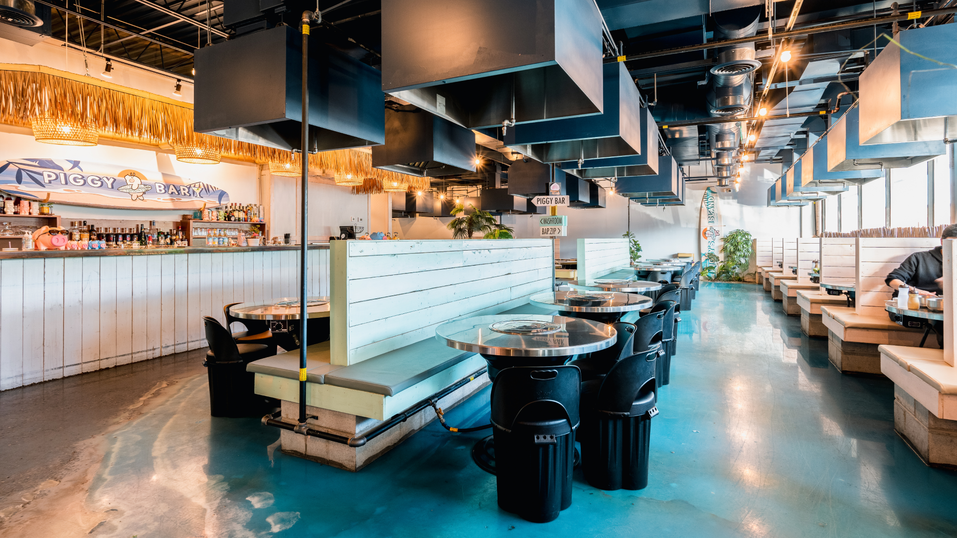
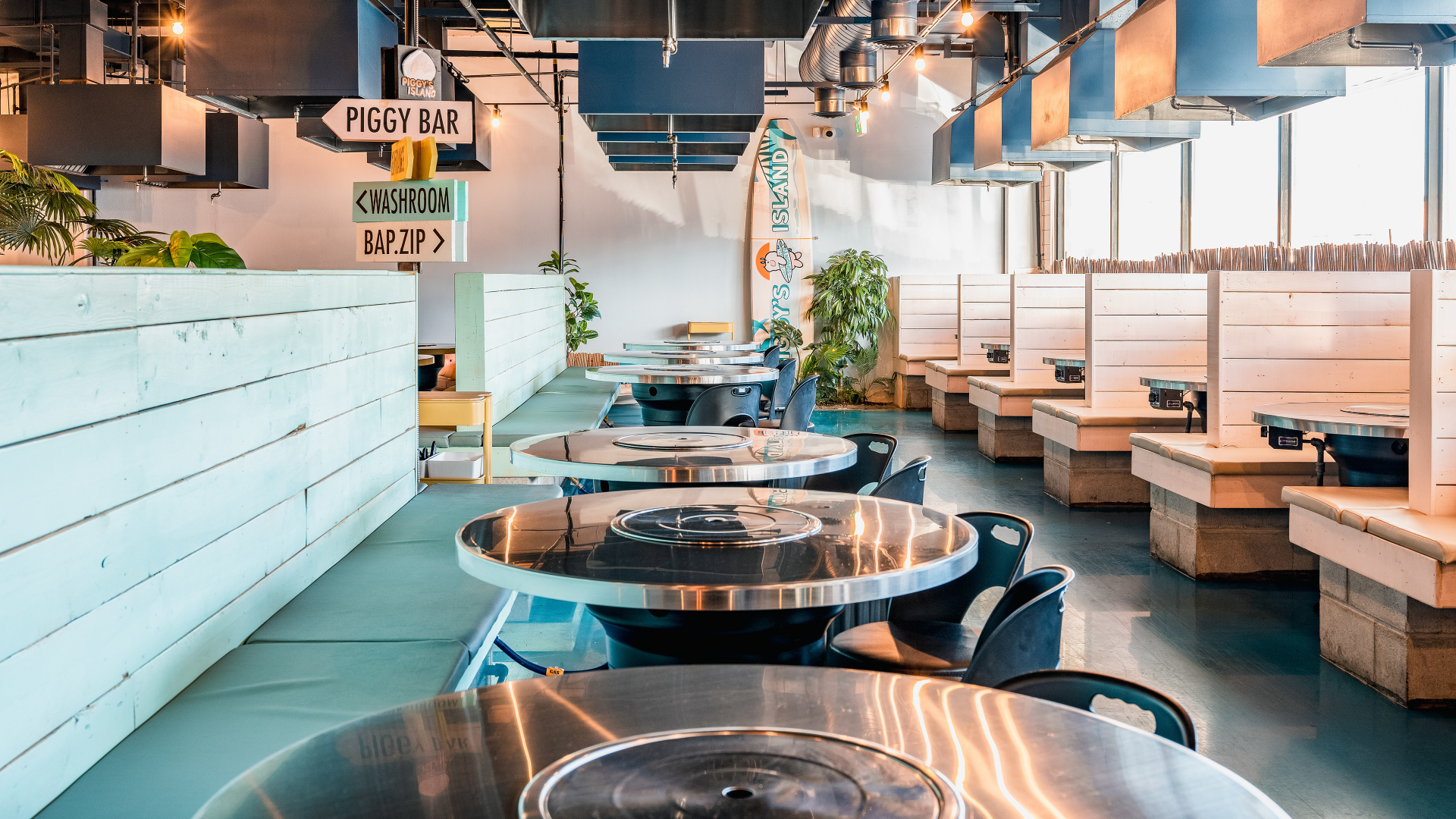
Brand Colour - Inspired by 'tiki bars' or 'surfy bars'. I used colours reminiscent of the sea and sky to bring a refreshing feel to the space. The palm trees and landscaping create a natural and tranquil ambiance, reflecting a relaxed beach vibe and a sense o adventure. this offers customers a comfortable and romantic experience, reminiscent of a vacation spot.
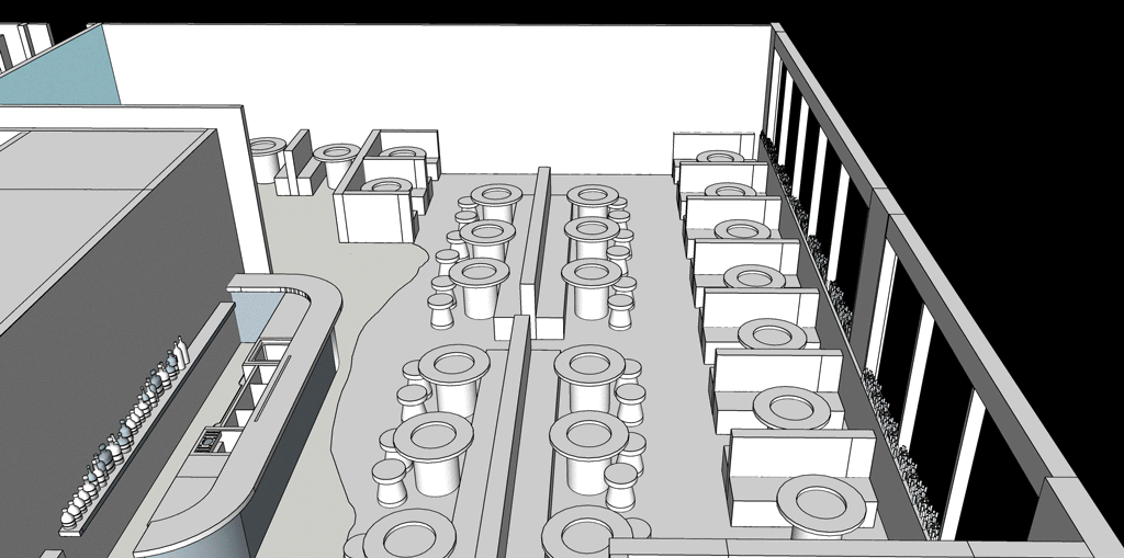
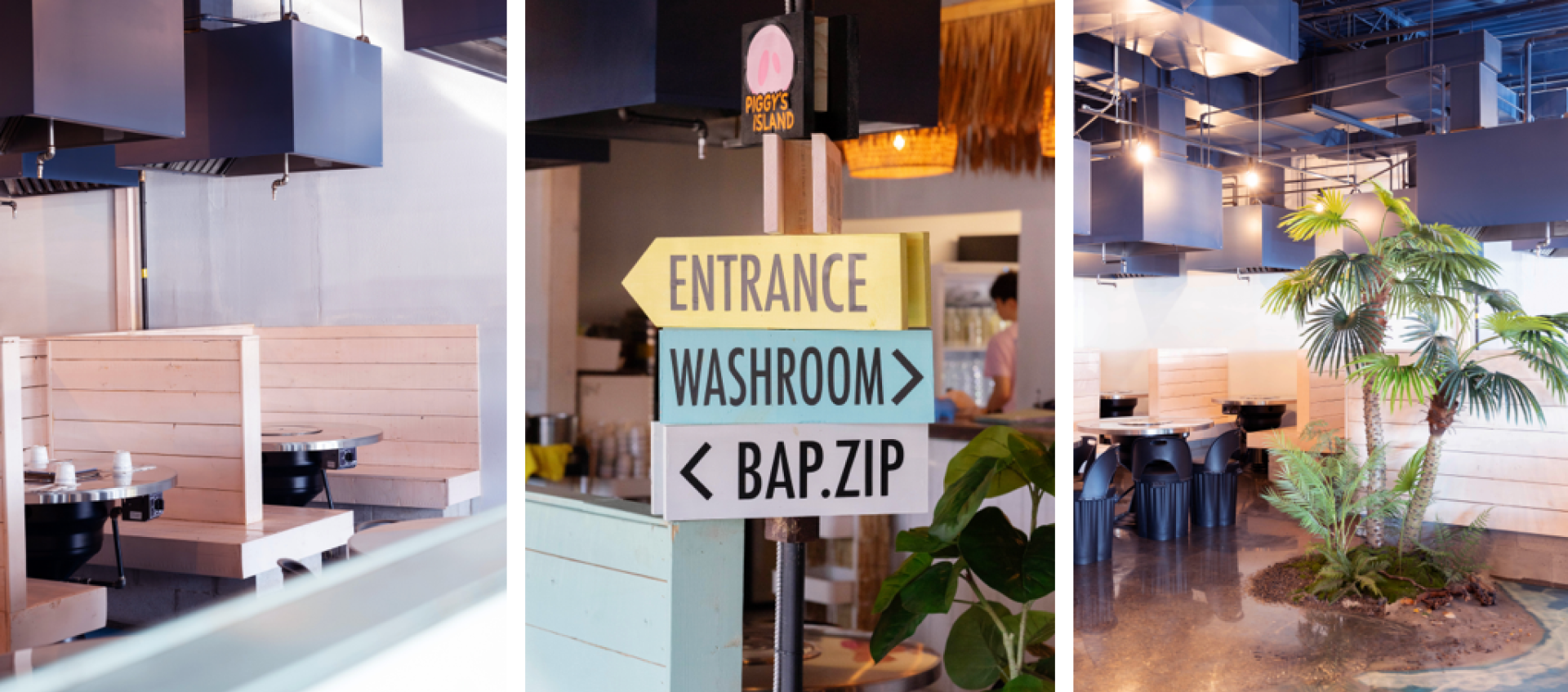
Space design:
When involved in the interior design of Piggy's island, I prioritized visual satisfaction and convenience for customers, as well as safe and efficient movement for kitchen staffs and servers. I carefully considered elements like lighting furniture arrangement, and colour palettes, aiming not just to create a photo zone, but to effectively use the entire space to enhance the visual enjoyment of all areas for customers.
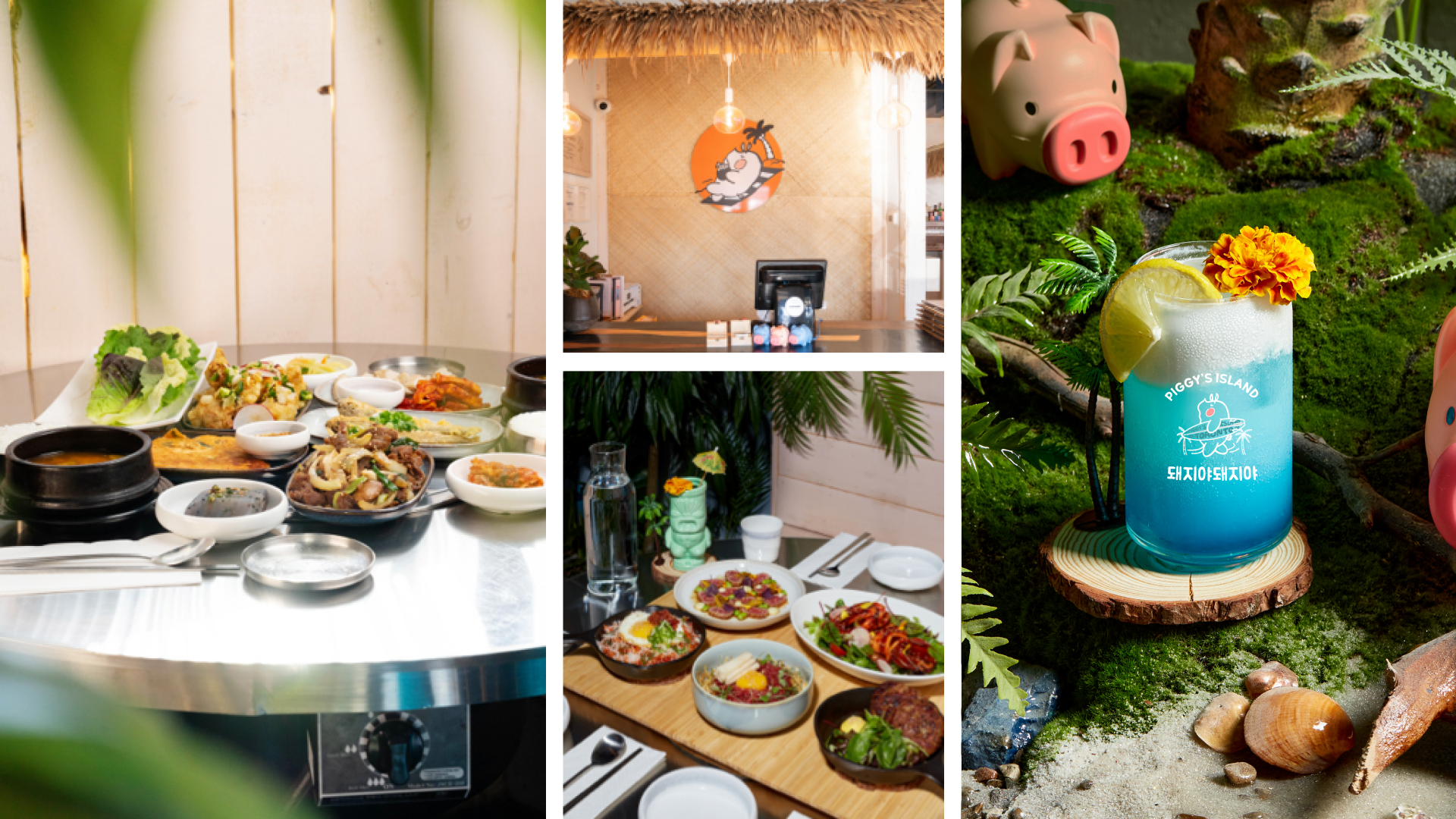
Menu design:
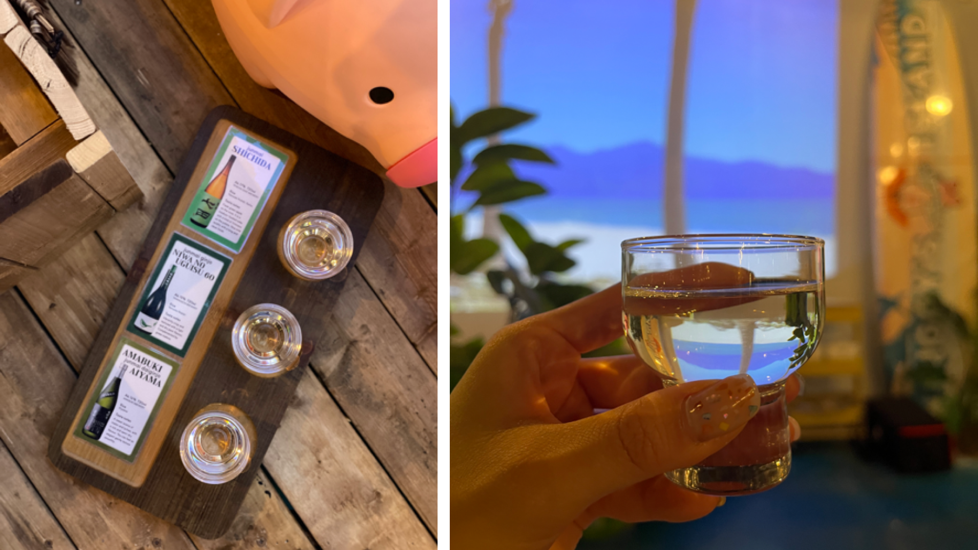
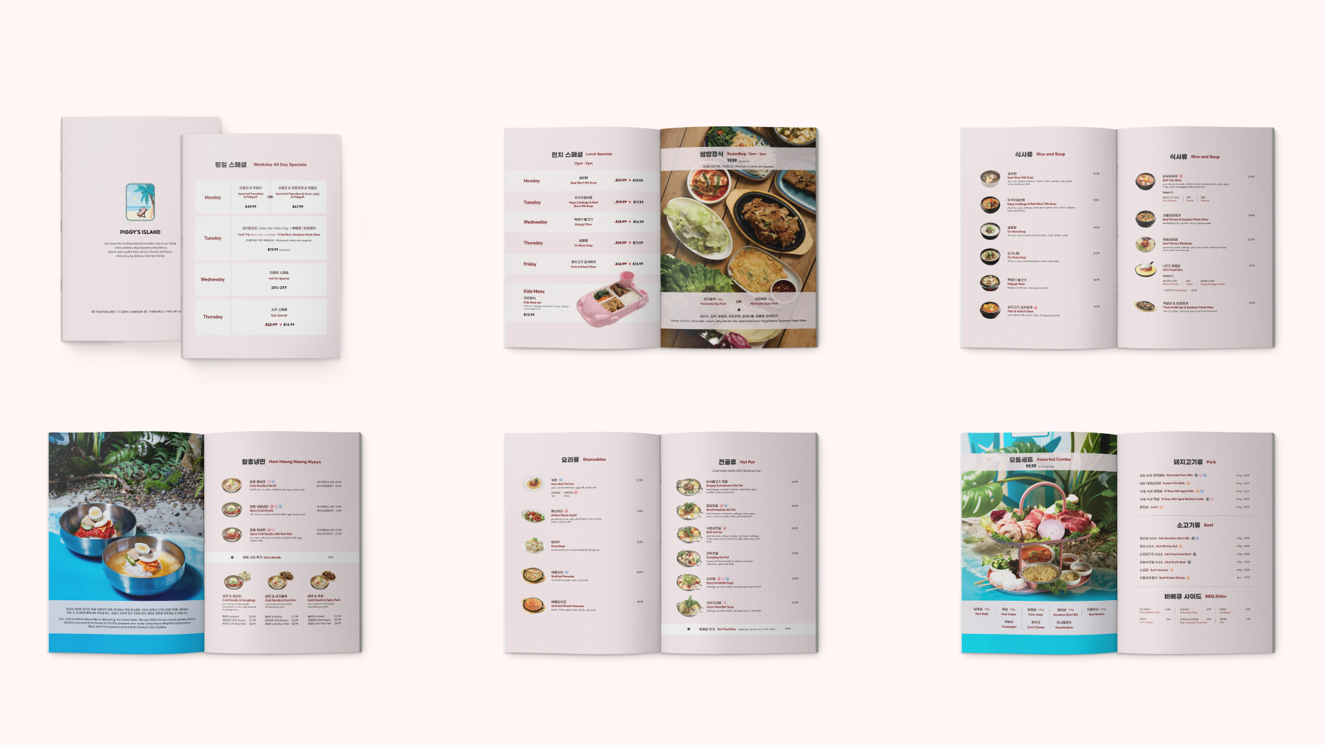
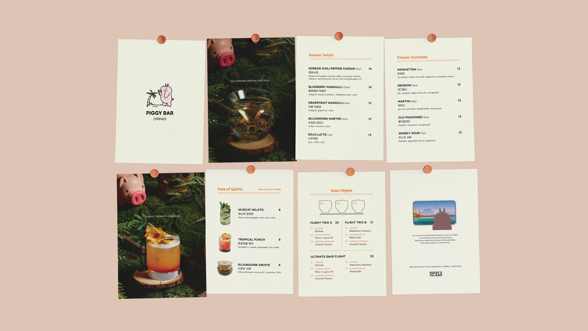
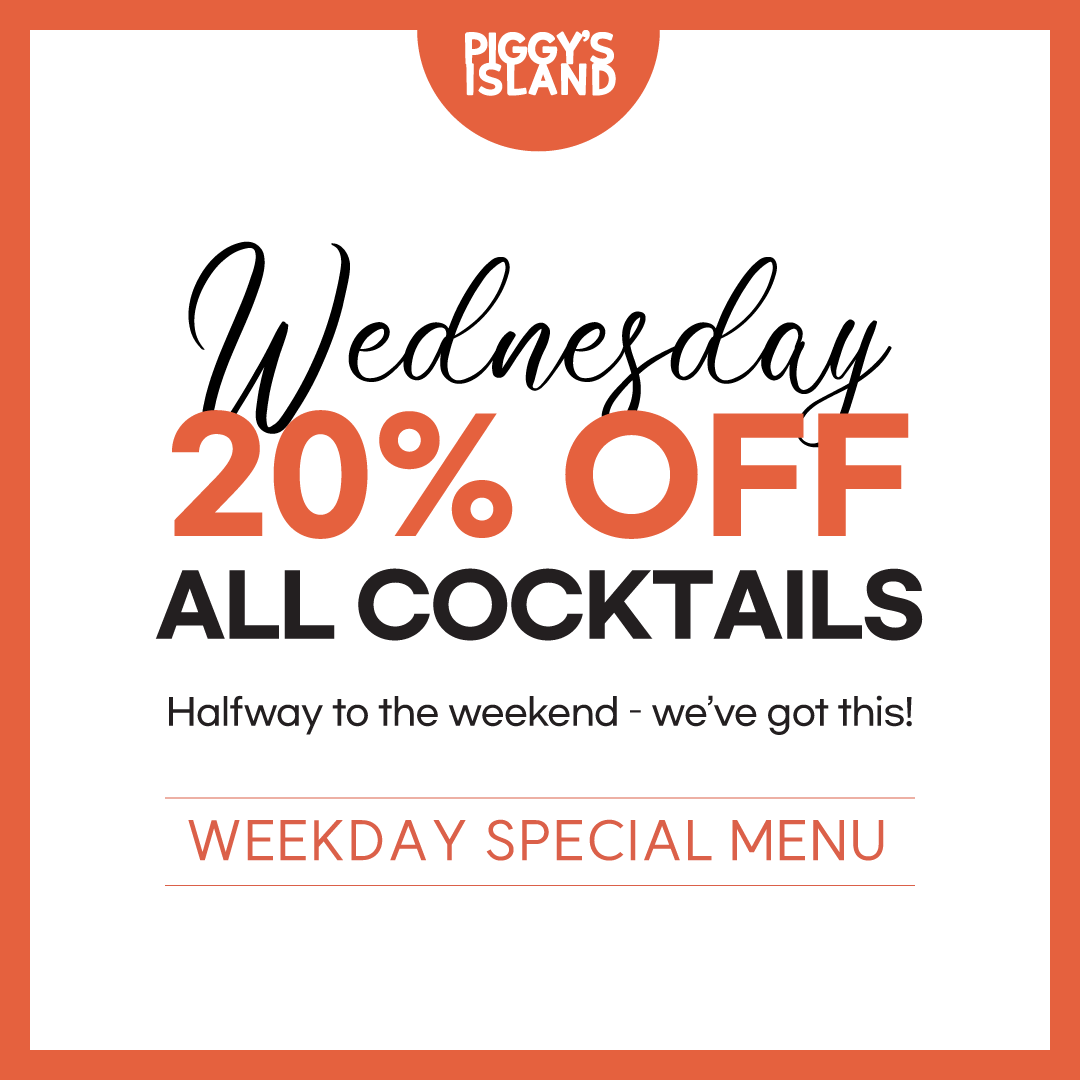
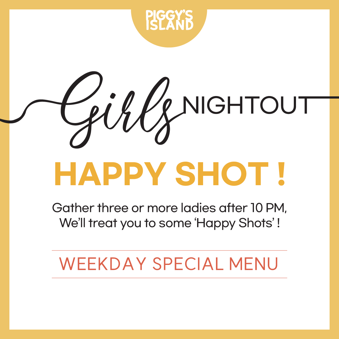
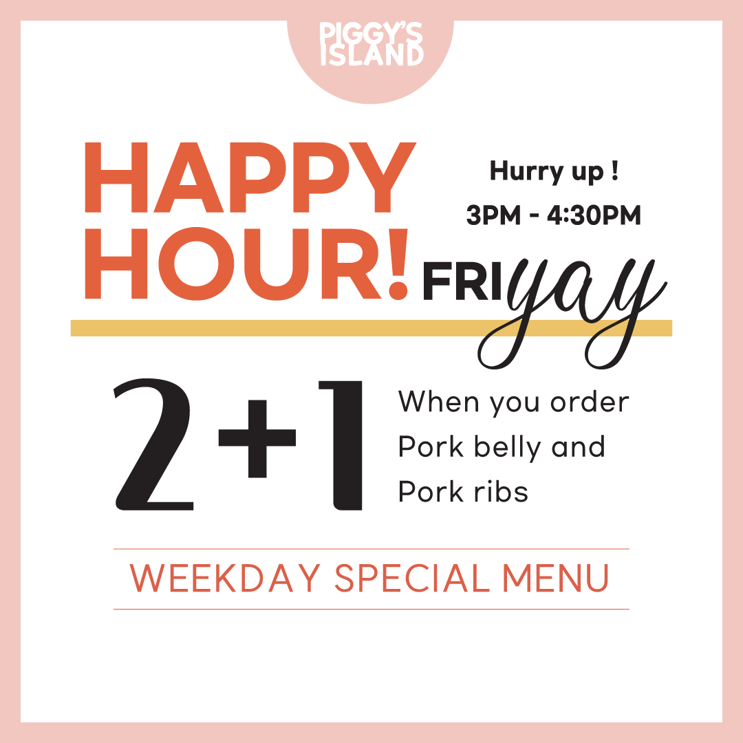
The Menu design prioritizes readability to ensure that customers can easily place their orders. special menu items are highlighted with fun and eye-catching designs, laid out simply to capture attention and encourage quick decisions. visually, the menu aims to resemble a resort catalog or magazine, adding the enjoyment of browsing leisure publications.


Our staff are like lifeguards,
ensuring a smooth and enjoyable experience,
To strengthen the Island-inspired brand identity, each staff role was assigned a uniform colour with intentional meaning.
● The kitchen team wears black, symbolizing professionalism and focus in a fast-paced environment.
● Servers wear pink, reflecting warmth and friendliness as the first point of contact with customers.
● Bartenders wear mint green, conveying freshness and vibrancy that align with the energy of the bar.
Together, these uniforms not only complement the restaurant’s coastal aesthetic but also foster team belonging while making staff roles easily recognizable for customers.
Through the rebranding project,
Piggy's Island successfully established a more modern and attractive brand image. By introducing a new logo, colour palette, and visual identity, the restaurant provided customers with a fresh and innovative impression, which helped attract younger audiences and families. The rebranding's impact was evident as it achieved full house capacity on weekends. Additionally, increased online visibility enhanced communication with customers. While some long-time customers who preferred the previous family-oriented image may have felt confused by the new design, overall, the rebranding received positive feedback and contributed to higher overall customer satisfaction.