
Year
2024
Project Scope
Logo Design, Brand concept storytelling
Overview
Jinny Kim is a real estate agent in Toronto, specializing in condos, home sales, and commercial spaces.
Clients describe her as warm, detail-oriented, and exceptionally attentive—someone who always goes the extra mile.
Clients describe her as warm, detail-oriented, and exceptionally attentive—someone who always goes the extra mile.
Challenge
⭐ Personal realtor brands often come across as stiff or generic, frequently using either a straightforward name or a company logo, making it difficult to convey a warm and approachable image.
⭐ Although the name Jinny Kim is affectionately pronounced “Genie,” this natural nickname was not properly reflected in the brand identity.
⭐ There was a need for a design language that could communicate not only trustworthy professionalism but also her unique warmth and attentive personality.
Solution
The brand identity was crafted around the nickname “Genie,” positioning Jinny as a magical guide who makes the home-buying journey effortless and personal.
⭐ Naming & Voice
The “Genie” concept was expressed not only as a nickname but also as a brand persona—friendly, approachable, and always attentive—differentiating her from conventional realtor brands.
⭐ Visual Identity
The warm, soft yellow tone conveys a friendly and comforting image while drawing attention and increasing visibility. It represents the “magical” experience of finding a home with Genie, infusing the process with positive and uplifting energy, and creating an overall lively and playful atmosphere.
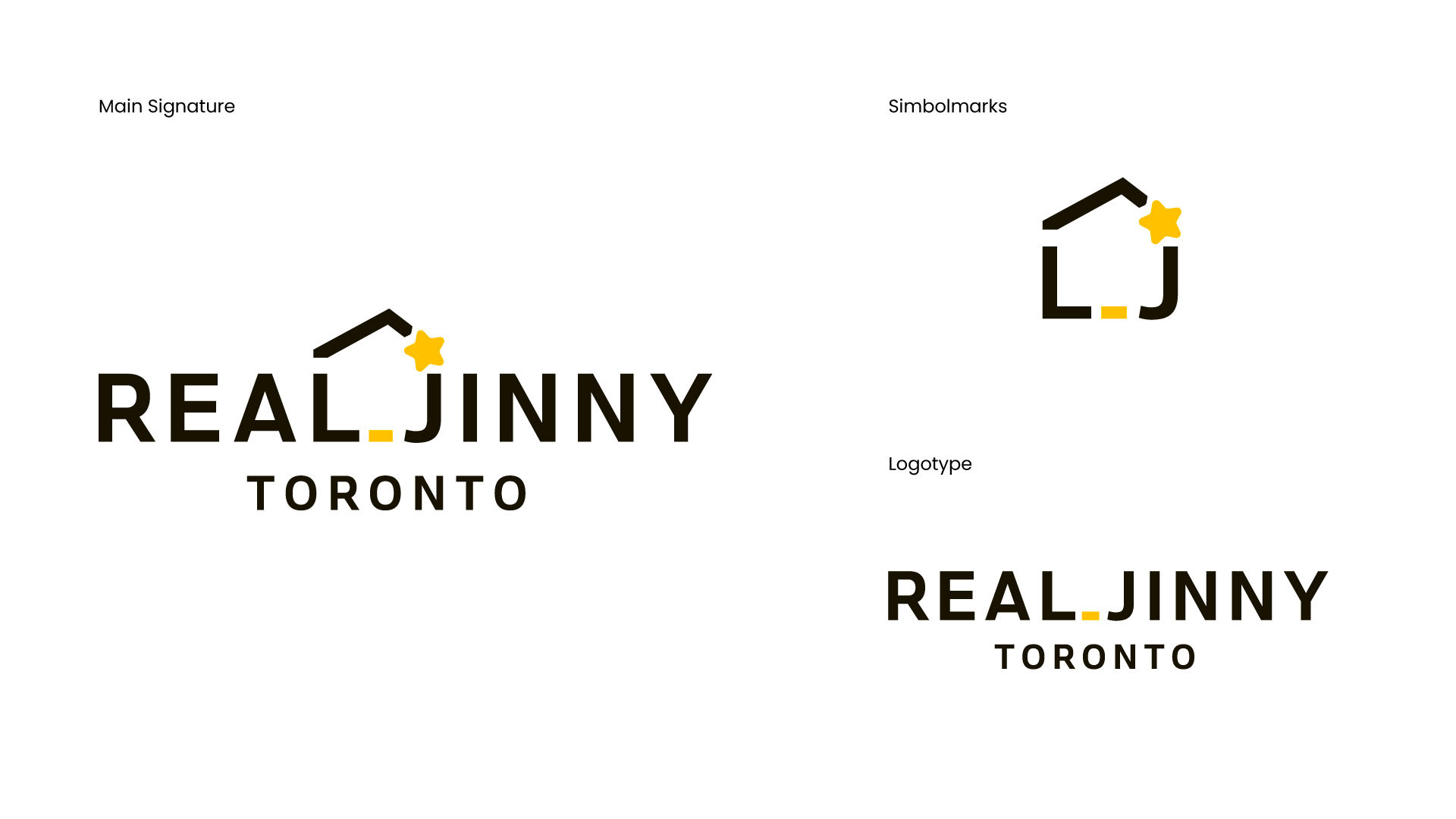
⭐ Logo & Symbolism
Inspired by the nickname “Genie,” the logo draws from a familiar phrase often heard in her community:
“Hey Genie — I mean, Jinny! Find us a cozy home!”
This playful identity reflects her approachable energy, reliability, and the almost magical ease she brings to complex real estate journeys.
⭐ Applications: The identity was extended across business cards, social media templates, and property brochures, ensuring a consistent, inviting presence at every client touchpoint.
Through this design system, Jinny Kim’s brand reflects not only trustworthiness and expertise but also her genuine warmth, making her stand out in the competitive Toronto real estate market.

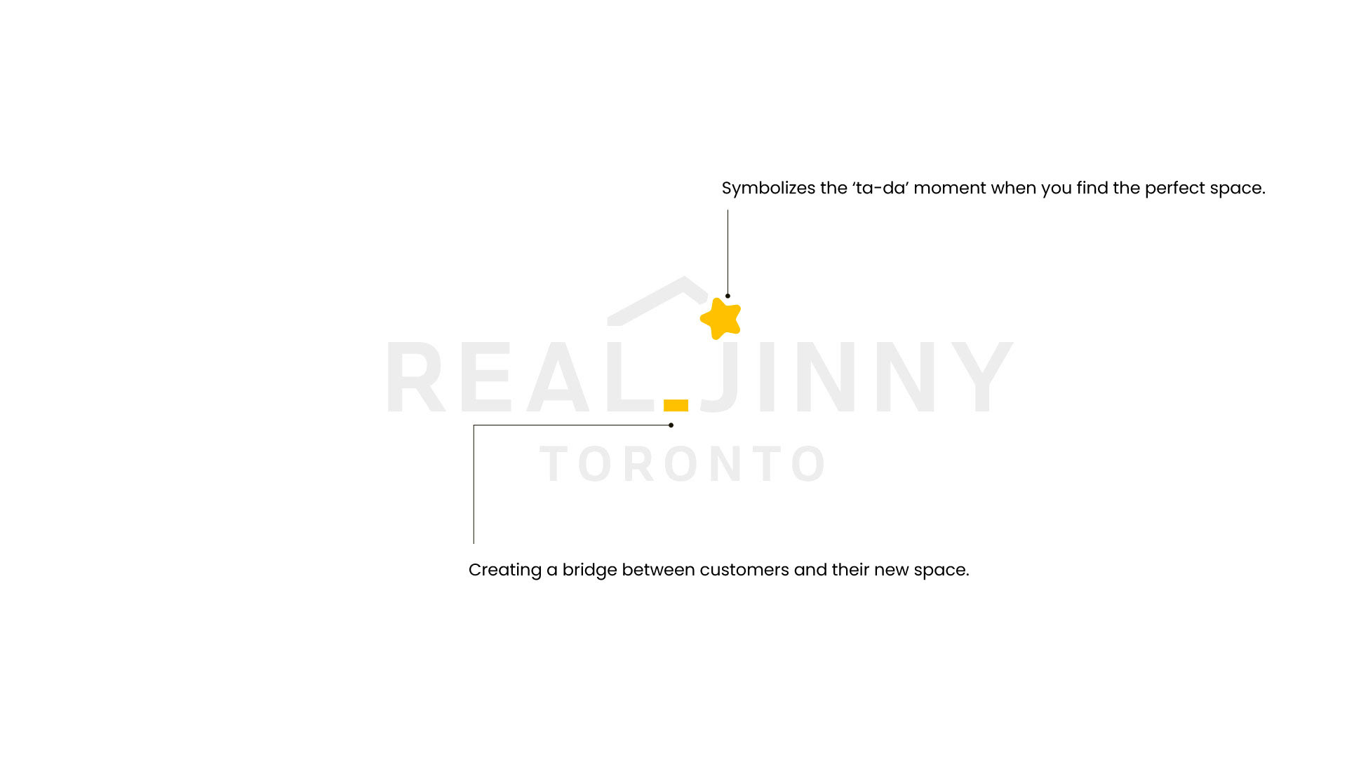
The star ⭐ above the roof symbolizes the “Ta-da!” moment when a new home is found.
In ReaL _ Jinny, the L and J form the walls of a house, while the underscore (_) represents the connection between clients to new places.

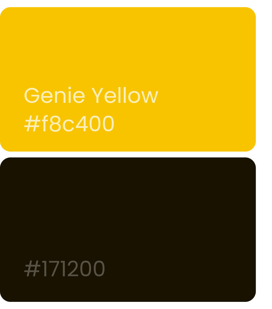
Colour Palette
The warm yellow accent, affectionately called “Genie Yellow,” captures the feeling of sunlight gently filling a home.
It conveys trust, hope, and optimism, reflecting Jinny’s role as a reliable guide who makes the journey of finding a home reassuring and joyful.
More than a decorative choice, the shade embodies the emotional spark that turns a house into a place that truly feels like home.