

The Potmill Dessert Brands
This project is the visual identity for The Potmill, a home baking brand created for those who embrace slow living while staying attuned to modern trends. It offers handmade cookies and canelés that bring the warmth of home-baked treats to everyday life.
Inspired by the quiet joy of daily rituals, the brand identity reflects a calm, minimal, and sincere tone.
From logo to packaging, every element was crafted to evoke warmth, care, and practical charm — making each dessert feel personal and meaningful.
From logo to packaging, every element was crafted to evoke warmth, care, and practical charm — making each dessert feel personal and meaningful.
The result is a flexible visual system that enhances both everyday enjoyment and the act of gifting with reusable packaging and a soft, neutral aesthetic.
The Potmill is not just about sweets! it’s about slowing down, savouring, and sharing.
Challenge
How can a home-based dessert brand express a unique identity through emotional storytelling and design?
My Role
My Role
Creative Lead, Founder
Logo, brand identity, packaging design, merchandise, social media design, illustrations
I developed The Potmill entirely from scratch, creating the name and concept, and designing the branding, packaging, and seasonal visual content.

Brand Story
The Potmill is a home-baking dessert brand inspired by the warm, handcrafted feel of traditional Korean mills and Western dessert molds.
Its name combines "Pot" (baking mold) and "Mill" to symbolize homemade warmth and creativity.
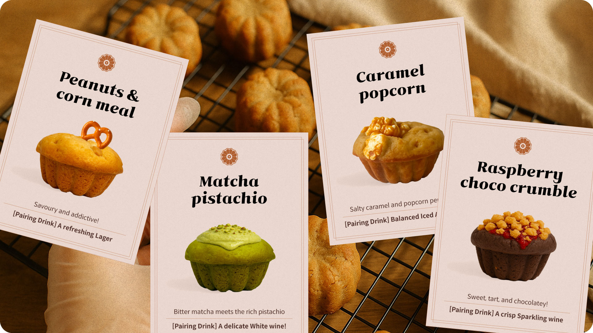
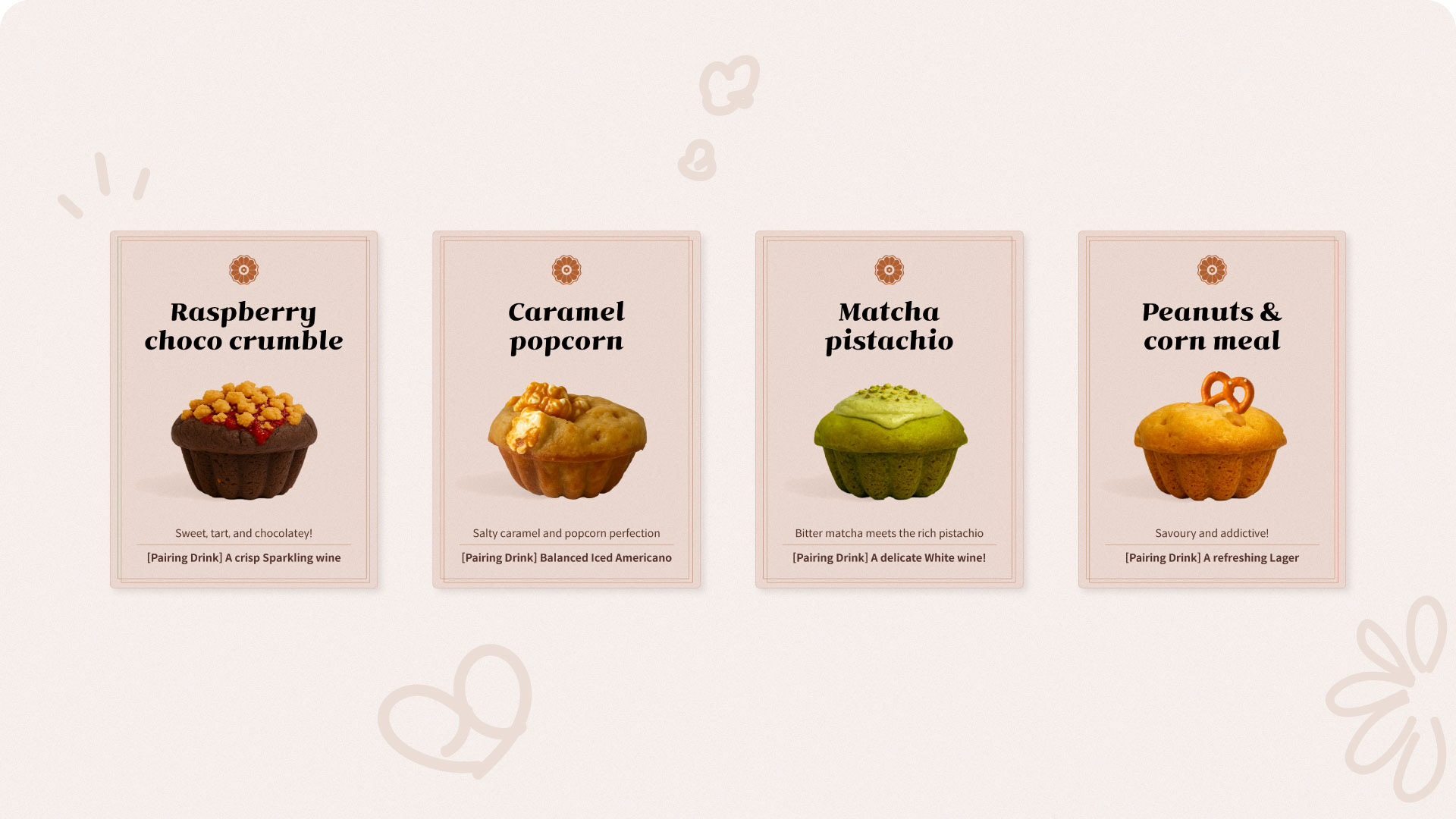
Each menu set presents unexpected flavour pairings using Asian and Western ingredients, presented with handcrafted visual identity.
Its name combines "Pot" (baking mold) and "Mill" to symbolize homemade warmth and creativity.
Each menu set presents unexpected flavour pairings using Asian and Western ingredients, presented with handcrafted visual identity.
Logo System
Logo Design
The logo was hand-drawn to reflect the imperfect beauty of home-baking. It combines a top-down canelé silhouette with a floral millstone pattern.
Typography & Colour
Typography & Colour
Inspired by the caramelized colour of baked goods.
Warm, Bricks, Caramelized desserts.


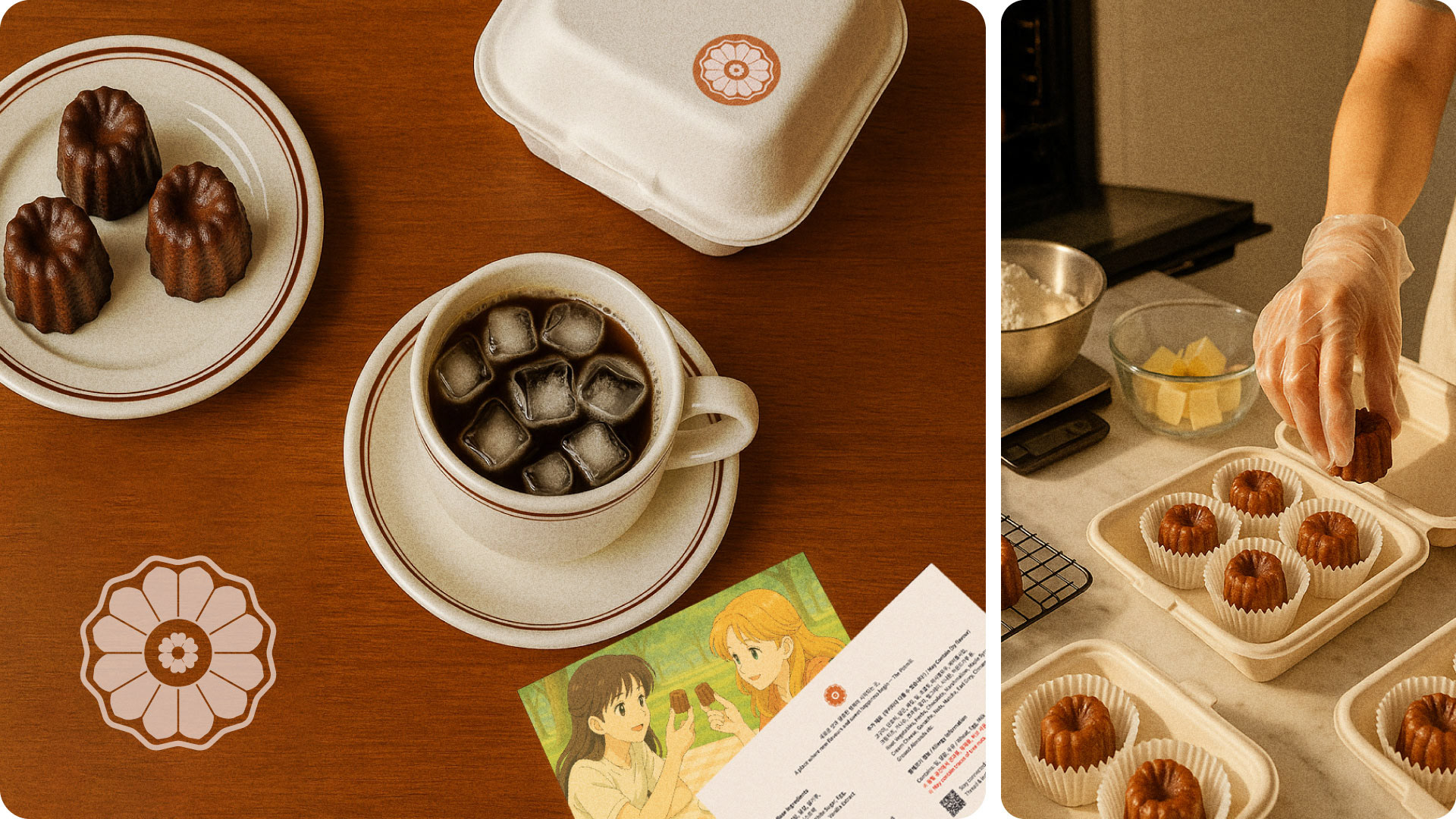
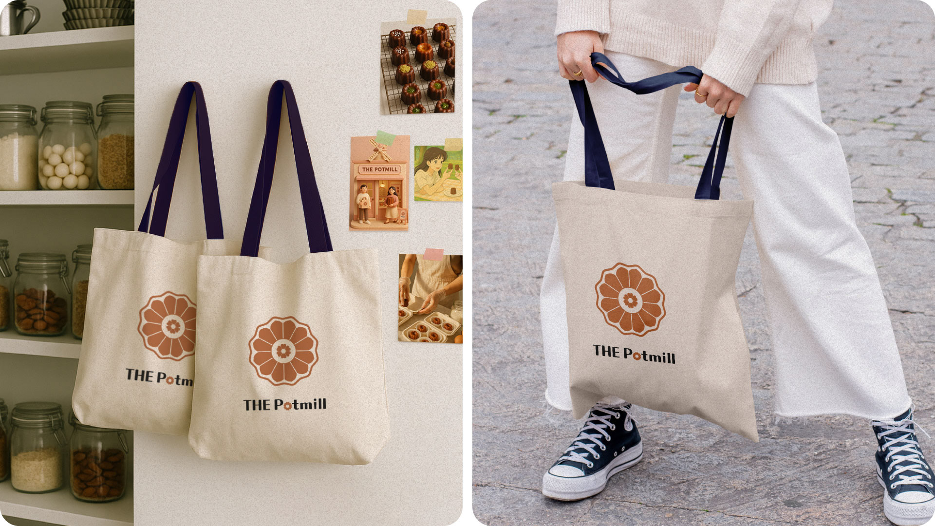
Packaging & Application
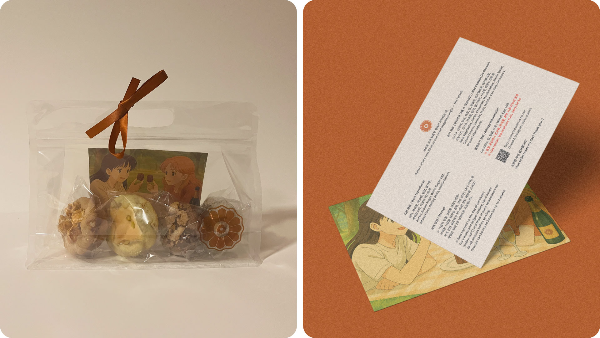
Each box is thoughtfully packaged to offer a warm, gift-like experience — from unwrapping the rustic top-opening box to discovering postcard-style ingredient cards tucked inside.
Reusable zipper bags and individually wrapped cookies add both care and practicality, capturing The Potmill’s handmade charm. This packaging was specially designed for a limited summer edition. The clear zipper bag evokes a picnic vibe, allowing customers to carry and share the Potmill experience with family and friends during their seasonal outings.

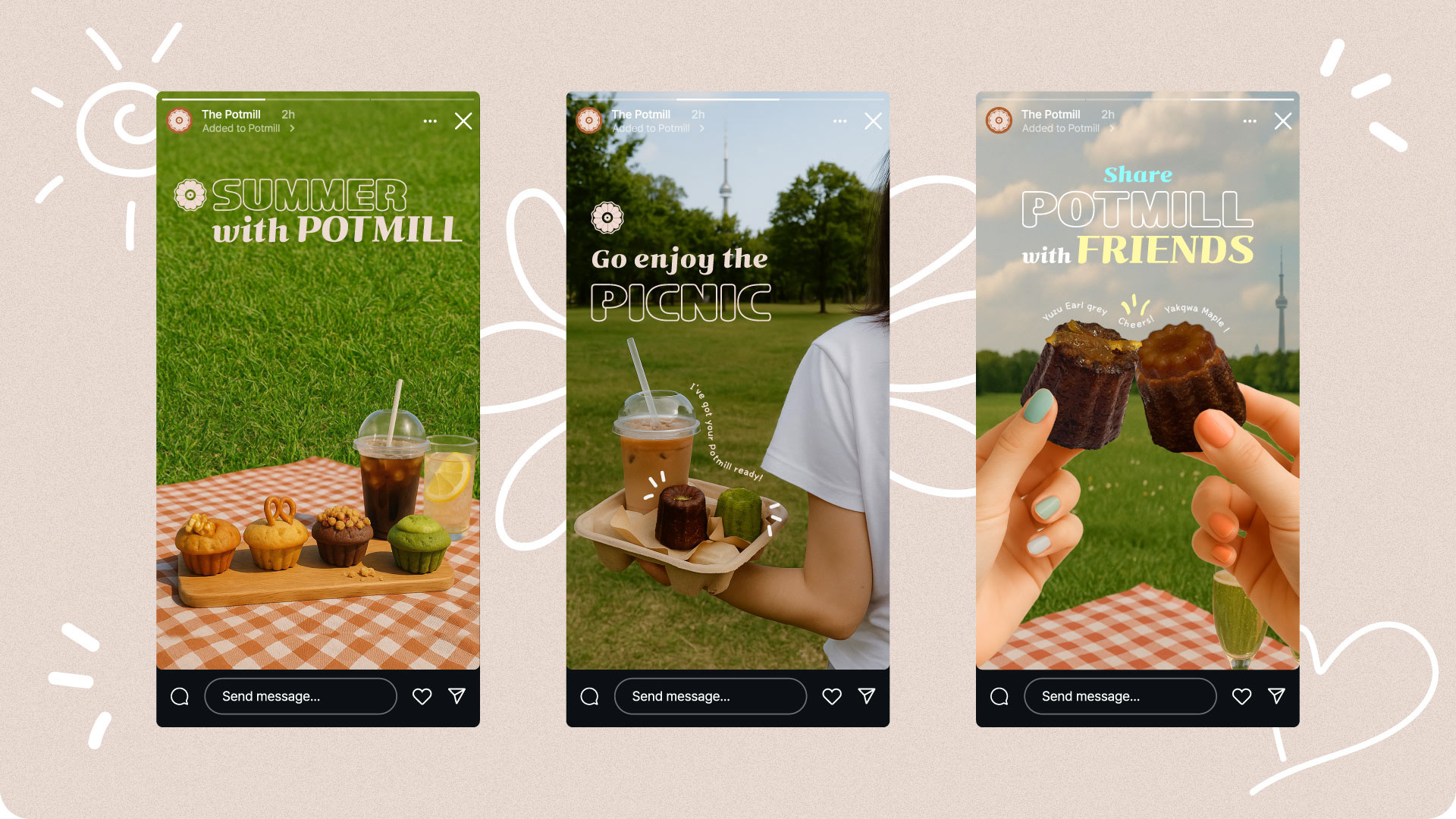
Social Contents and Mockups
The Potmill's social content focuses on seasonal mood, intimate storytelling, and warm visuals to build trust and emotional resonance with its community.
Hand-crafted layouts and packaging previews were shared across Instagram to tease monthly drops and highlight the care behind each order.


Every pre-order sold out within 24 hours of launch.
90% of customers returned, often ordering two or more boxes.
Gained nearly 500 followers on Threads within 3 months,
with 40.1k views in the last 30 days.

What I learned,
I realized that in home baking, branding and emotional storytelling are not just about looks but are essential to building trust and sparking curiosity. The tasting box concept invited new customers to explore flavour combinations that felt both unfamiliar and approachable, while returning customers enjoyed being able to personalize their sets.
Even when I had to pause the brand for personal reasons, I received heartfelt messages and small gifts from customers. It reminded me that a sincere brand can create genuine connections.
Through this project, I learned how branding can become emotion, and how emotion can grow into loyalty. The greatest reward for me was seeing someone who had never met me remember my dessert, recognize my logo, and choose to come back again.